
Are you reading this article on your desktop/laptop or your smartphone? Most people, to be more specific, 55% of Internet users worldwide, use their smartphones. That’s millions of people in front of phone screens, looking at different websites every day.
This massive trend in consumer behaviour makes it critical that websites are not only meant to be viewed on desktops. That’s exactly what responsive website design is for!
So, what is it?
In more definitive terms, responsive website design is a web design approach that changes the appearance of a website based on the screen size and orientation of the device being used to view it. It basically means that the web design automatically adjusts based on how it is viewed– whether on a phone, laptop, desktop, or tablet.
With a responsive website, someone can browse your website from any device and it will still look and function perfectly.
The Web and Mobile Devices
There was a time when you could only access the Internet with a desktop computer. Now, mobile web traffic has overtaken all other devices in the running. As mobile users make up the majority of search engine visits, mobile has become one of the most important advertising channels.
Today, it is impossible to ignore the emergence of mobile phones as the tools most users prefer to use when browsing the Internet. Mobile Internet has now transitioned into an indispensable product.
- 79 percent of Australians own a Smartphone
- 91 percent of Australians own a cell phone
- 63 percent of Australians use smartphones to browse the Internet
Responsive Design Vs Adaptive Design
If you’ve encountered the term responsive web design, it’s highly likely that you’ve heard of adaptive design as well. Although both offer an approach for cross-platform web design, they operate and are designed quite differently.
Adaptive Design
Adaptive website design employs multiple sizes of a single fixed design. These are completely different versions of the same page. How this works is a script detects screen sizes or the available space, then selects the layout most appropriate for it. The template designed for the specific device is then accessed.
Responsive Design
Responsive design is a more fluid approach to web design. It utilises one layout where all the design elements are reconfigured according to how it’s viewed. This type of design adapts the rendering of a single page version but CSS code will control the layout and render it differently based on the screen.
Examples of Responsive Web Design
Head on over to mediaqueri.es — an online gallery that features responsive web designs.
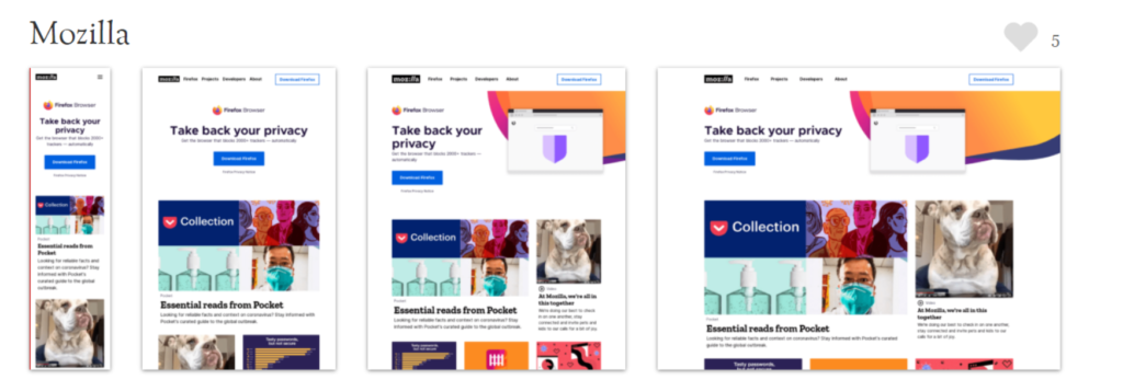
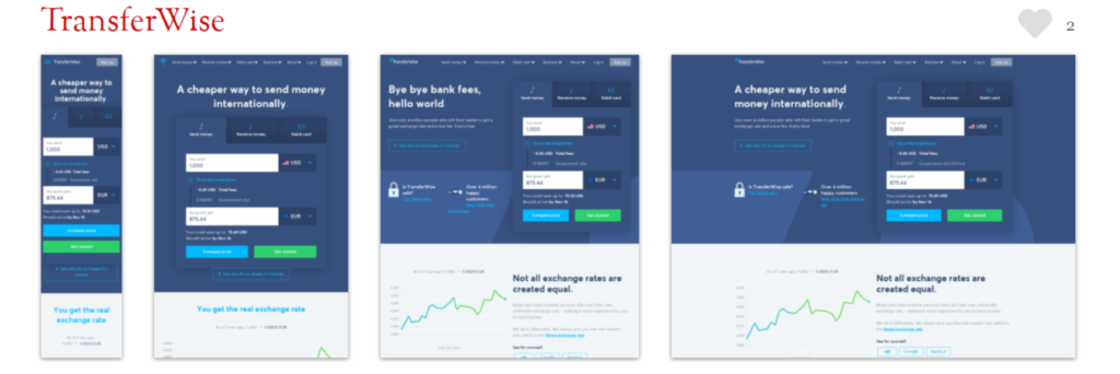
If you look at the sites from different devices, you’ll see how the pages alter their layouts to fit the device you’re using.
How It Works
A website is made up of a set of files. The home page, about page, and every other web page on the site is an individual file. Each file contains HTML code and content in the form of texts and images. These pages are styled with files called Cascading Style Sheets (CSS).
Responsive web design operates through CSS, using different settings to serve an array of style properties based on the characteristics of the user’s device. These properties include but are not limited to the user’s device:
- screen size
- orientation
- resolution
- colour capability
A responsive website applies a different set of CSS files that controls how the website looks depending on the current device being used to view it. In comparison to the standard non-responsive web page, a responsive site responds differently depending on the user’s device.
Do I Need A Responsive Website?
If you’re new to web development, web design, or you’re simply starting fresh with a new site, you might be wondering if you need to have a responsive website.
The short answer: Yes.

Nowadays, it’s no longer enough to design websites for a single device. Knowing that more than half of the world’s Internet users surf the net with a mobile device, it would be bad judgment to serve them a page simply designed for desktops. Aside from being more difficult to use or read, it will ultimately lead to a bad user experience.
Your landing page should be optimised for easy mobile use. If not, then advertising online may not produce the results you’re hoping for. Optimising your site for mobile users can maximise the ROI of your marketing efforts. With higher conversion rates from your site, you’ll have more leads and a cost-effective ad spend.
One of the main objectives of creating a website with a responsive design is to keep things simple. Responsive websites should be easy to open or load on multiple platforms. Users should have no trouble opening the website on platforms such as PCs, laptops, tablets and smartphones.
How To Know If My Website Design Is Responsive
Want to know if your website is already responsive? A quick and easy way to check is through your web browser:
- Open Google Chrome.
- Go to your website.
- Press Ctrl + Shift + I to open Chrome DevTools.
- Press Ctrl + Shift + M to toggle the device toolbar.
- View your page from different devices’ perspectives.
You can also choose to use Google’s Mobile-Friendly Test to see if the web pages on your site are mobile-friendly. While you can optimise your site for mobile devices with other web design approaches such as adaptive design, responsive web design is the most common and, usually, most advantageous solution.
Web Design With A Difference
Employing a responsive web design is only part of the process of building a strong website. As web design experts, we understand that a website should be well-designed, engaging, and easy to navigate. A website connects people to your company, so we make sure it’s optimised to get people coming back for more.
Here at 5Tales, we recognise a website’s influence in the marketing funnel. It is the place where customers will generally both make their purchasing decision and then act on that decision by placing an order or making an enquiry.
That is why we build websites and webpages that look good, work on all devices and are built to convert. Trust your responsive web design needs with us, and we’ll make sure you get set up with a site that sets you apart. Contact us today!