When it comes to design, we all struggle at times to work out how our content and branding should be styled. Selecting colour palettes is something only true designers can excel at, but just picking one colour still tends to stump us all.
Every brand needs one to two key colours which are distinctly theirs. Whatever colour you select is going to represent your business, so it is important to know what each colour means.
Through numerous studies which have sought to get subjects to associate a word, emotion or feeling to a colour – we can understand what a potential customer sees in your branding:
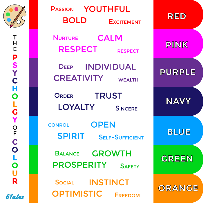
With that chart in your back pocket, you can begin to decide what colour matches who your business is or how you want your company to react to you. That said there is more to colour than just that.
[cta id=”2091″ vid=”0″]
A little bit of Colour Theory 101
Aside from selecting the broad family of your colour (ie. green, blue, orange etc.), you need to decide on the colour in a far more specific way. So let’s start with a bit of theory:
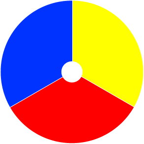
Primary, Secondary & Tertiary Colours
We all remember the basic primary, secondary and tertiary colour wheel from our early schooling years, but here is a quick recap of the 12 basic colours:
 Primary Colours: The basics, the originals. In primary school these were the colours when painting that cannot be created by combining two other colours.
Secondary Colours: This selection of colours is what you get when you mix any two primary colours together and are the first expansion of the colour wheel.
Tertiary Colours: The final group of the 12, this is where the first variations on previous colours come in like “green-blue” and “pink-purple”. All of these colours are created by mixing a primary and secondary colour.
Tints, Tones & Shades
Now, as great as those original 12 are – we all know there are more colours in the crayon box. That brings us to defining what the variations of colour are:
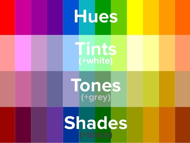
Hue: This is just the more technical term to describe any of the 12 colours on the colour wheel.
Tint: A tint describes what occurs when any hue is combined with white. This can also be called ‘lightening’ a colour.
Tone: Tone describes the results of when a hue is combined with grey or white and black. This can also be called ‘dulling’ a colour
Shade: Shade describes the result of when a hue is combined with black. This can also be called ‘darkening’ a colour.
The Completed Wheel
 There we have it – those initial 3 colours on the wheel, have spawned a wheel of 48 base colours. It is from that wheel that we get any and every other colour we can imagine.
From those 48, you can create any of the colours for your brand that you can see at the start of the article. That said – you will have to match some extra accent colours to your primary branding colour. So how does one do that?
Colour Combinations
Having colours which as a whole are visually appealing to look at is the basis of design. To have combinations which appeal to the eye, display the companies Let’s break down the two most common combinations; monochromatic and complementary.
Monochromatic
A monochromatic colour scheme is a combination of shades, tones and tints of a single colour. Let’s use a red colour scheme for example:
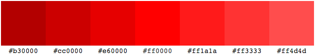
By adjusting the colour ever so slightly you can build a scheme that bases itself on just one colour. Now although this works together – it is obvious that this kind of scheme can end up blending together and being somewhat unappealing.
Complementary
Complementary schemes are based on using opposites on the colour wheel. That means looking at the wheel and identifying the two colours that are their exact opposites. This generally means you end up with only two colours compared to the generally larger number of colours in a monochromatic scheme.

Where to now?
Keeping in mind the emotion of colour, how colour works together and what all the different terms mean – it is time to decide for yourself what you want your company to be.
Choosing from scratch can be hard so that’s why we recommend trying to use a colour scheme generator. Give it a go and see what schemes you can come up with.
[cta id=”2091″ vid=”0″]