What is an infographic?
An infographic is a way of a representing information in a visual form. The aim is to simplify the data and make it understandable at a glance. The genre can be varied – they could be statistics, academic, or even a timeline.
“Why do I have to be a hands-on infographic creator?”
You might have learned from 10 Tactics To Make Your Content Marketing Sexier how essential visual content is to your content marketing.
Visuals draw the ATTENTION of your audience far greater than any wall of text can.
As such, it is easy to see why visual content is so powerful. Studies have also shown that reader’s ability to recall information soars significantly when information is presented as an image. It creates long-term memory.
A study by Dr. Lynell reveals that after three days,
- 10-20% is recalled from written information
- 65% is from visual information
Thus, the challenge for you, as a content writer, is to combine the 65 with the 20, so that readers have more than 80% chances to remember your content. This means impression.
But how?
Infographics kill two birds with one stone.
[cta id=”2091″ vid=”0″]
3 Simple Steps to Make Your First Infographic
Dealing with visual content can be tricky, particularly if you are not a digital native — not being really accustomed to graphic design and so forth.
Don’t worry. I understand how tough it can be at first. The tips & tricks are here for you. Follow these bit-by-bit techniques and I guarantee you will be on track in no time!
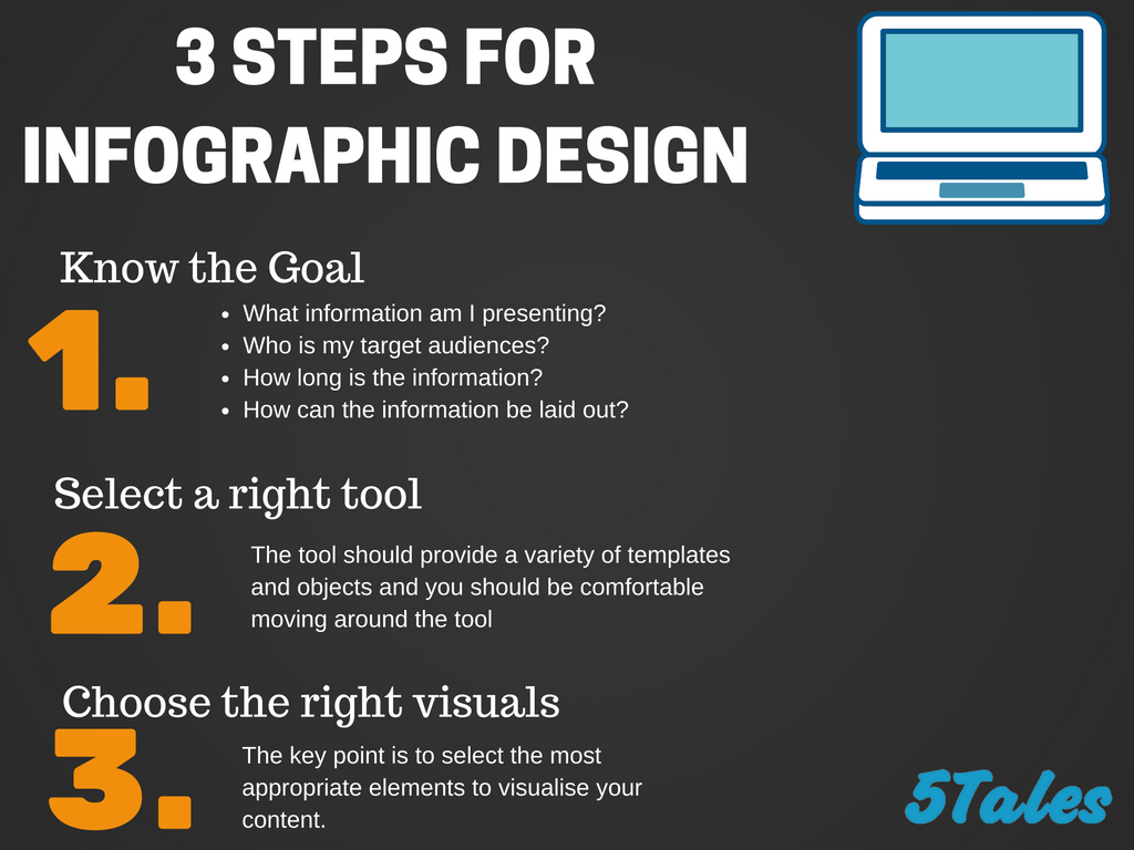
Set the Goal of Your Infographic
On your piece of blank paper, or whatever you are able to set down in writing, answer these guiding questions.
- What information am I presenting? E.g. what services do you offer? why should customers stop by your business?
- Who are my target audiences?
- How long is the information to be presented? How can I keep it as short as possible while essential information is kept?
- How can the information be laid out?
All at once, also aim to capture ‘Aha!’ moment from the reader. Elaborately synthesize your complex topics, in case you have ones like statistics, by choosing the visual elements that best present your information. This is discussed later in the following steps.
Select the Right Tools
As might be expected, online platform offers you a lot of choices to create ones. Nevertheless, when it comes to content marketing, it’s a matter of quality, not quantity.
Speaking of which, bear in mind that the tool should provide variety of templates and objects.
Among the free online tools, regardless of how sophisticated you are, I reckon easel. Plenty of at hand tools you may need on the website. This includes objects and templates which are pretty assorted — timeline, items descriptions, and statistics. The distinct advantage of this is having an absolute freedom to customise your own easel.
Sign up and have fun!
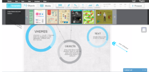
(easel.ly)
Canva.com is also one of my favourites. Within the platform, you are able to use many free photos, icons, and illustrators. Additionally, you can customise your own chart from the given diagram templates. This is relatively convenient!
Despite the various free options you can hop on, you can also buy extra templates or images if needed in your work. Tapping into an army of designers is a great idea when you can’t create one.
Choose Your Symbols Wisely
Once you know what to visualise, now it’s the time to figure out how to do it. The key is to select the most appropriate symbols to represent your content.
For example: you are discussing three different countries – Australia, New Zealand and Thailand – you may include the country’s most recognisable indigenous animals.
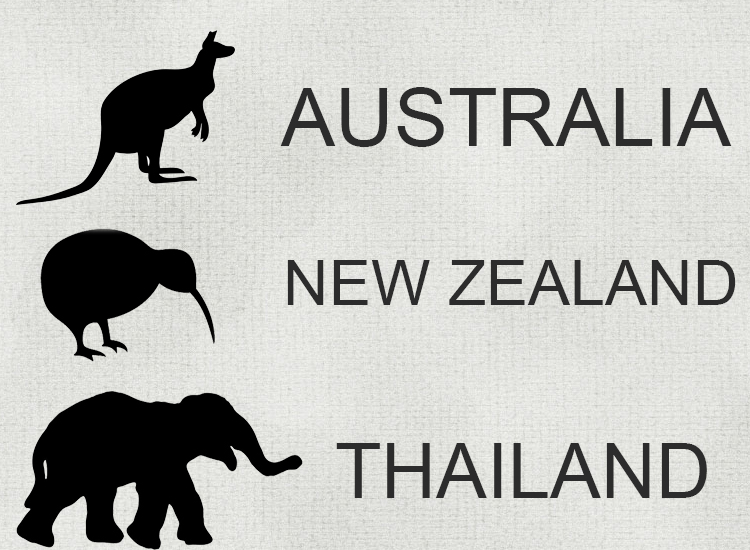
Tip: Keep trying alternatives until something sticks. For example, in this case, it could be a flag. You never want to overuse a symbol, mixing it up can make a major difference on the overall quality of your content.
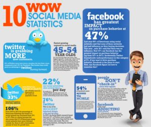
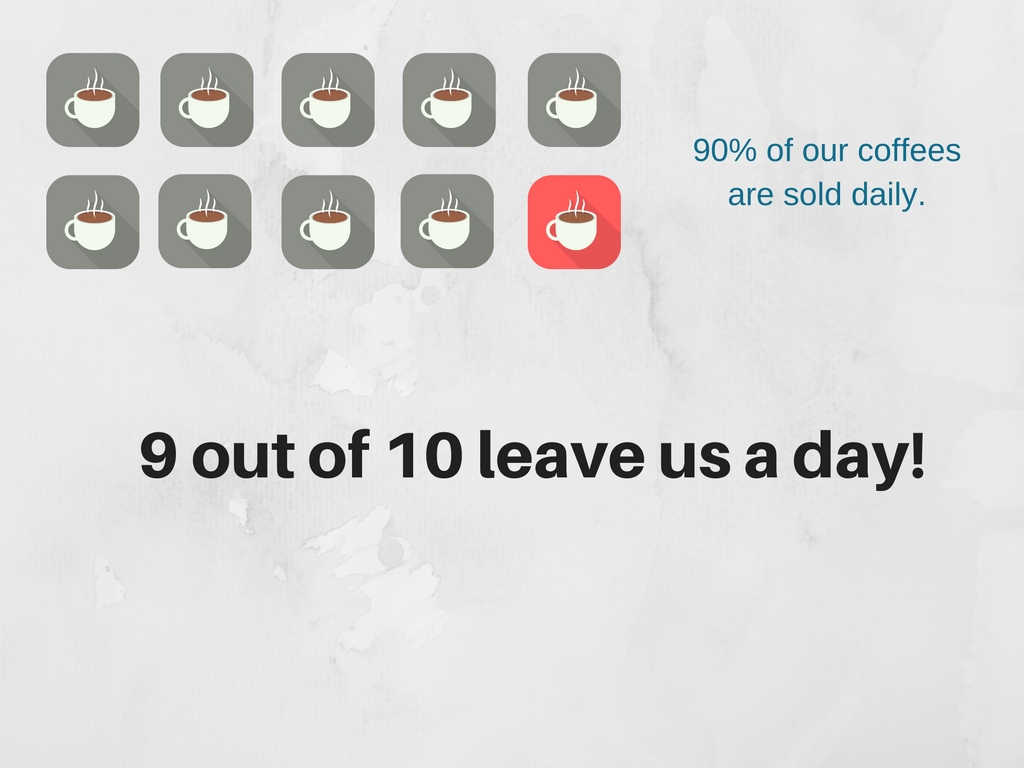
Another point I have to mention is about statistics. Numbers are significant and yet, simultaneously, can be boring. But once they are visualised, they become far more attractive and approachable. Numbers can be presented in many different visual styles, see below for an example:
Colour Matters
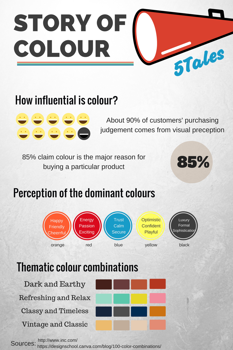
Colour is far and away one of the most defining factors of visual content. Using it correctly can instantaneously change the meaning or impact of your content. Take a look at this infographic which tells you the story of colour.
PS,
Before finalising your infographic, make sure you are able to say “yes” to these three questions.
- Is my infographic understandable?
- Are the visual and textual elements well-organised?
- Does it have all information I want to present?
[cta id=”2091″ vid=”0″]